Bali favourites: Livingston Cafe & Bakery

Driving along Petitenget Street this morning I stopped at one of Seminyaks latest cafés, Livingstone.

Its exterior is impressive. Three stories high in a mixture of raw metal, glass and timber. It is industrial chic and rustic glamour combined. Its neutral colour scheme drew me closer! It is a cafe and a bakery that could be picked up and transported to Melbourne and would instantly become a hit. 

Livingstone Bakery was opened a few months ago by a group of coffee and good food lovers with the philosophy of having everything baked fresh, daily on site. its a philosophy that sits well within this large open plan space, where everything is on show.

The cafe makes great use of natural light, with large glass windows blending the interior with a large outdoor deck.

Livingston is stunning yet unpretentious... and the coffee is good!

Livingstone Bakery 

88 Jalan Petitenget, 

Seminyak.

image.jpg
image.jpg
image.jpg
image.jpg
image.jpg

Bali favourites: Corner House

It's been almost five years since I last set foot in Bali. On my last visit I was inspired by the new breed of high end restaurants and hotels that had begun to appear along the quiet and remote streets of Seminyak and Petitenget. They were magical.

Arriving in this district a few days ago, I was stunned at the change. The spacious streets with gentle breezes flowing in over open rice fields are no more. The quiet unmade roads that wound through local farmlets to deserted beaches have gone. The handful of spectacular new hotels have multiplied and it has now become a heavily developed scene of shops, cafes, mainstream bars and clubs.

However, amongst the chaos, I've discovered a handful of sophisticated spots that manage to stand out from the crowd. 

On the corner of Jl Laksmana & Jl Drupardi is the Corner House (formally the Corner Store) It is fashionably resplendent in black/white/grey, It's modern & edgy, New York meets Paris in downtown Seminyak! The newly opened Corner House is definitely tres chic! 

Nighttime, when the interior lights filter through hedges of magnolia, is when the cafe captures your attention. Downstairs is all about natural wood, white tiles, exposed bulbs and vintage styling. Upstairs is glamourous, with a stunning bar, the showpiece of a sophisticated and high end interior.

Corner house is a gem. Catering to lifestyle too, there is a wonderful collection of clasic linens and home wares for sale. The styling and finishes are superb and the attention to detail is inspiring. 

Corner House

10a Jalan Laksmana 

Seminyak

image.jpg
image.jpg
image.jpg
image.jpg
image.jpg
image.jpg
image.jpg
image.jpg

Saving tara

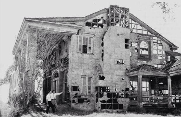
I make it no secret that I am a fan of Hollwoods golden years. Sadly, much of the nostalgia, artefacts and movie sets from the era have been lost or destroyed. Therefore, I was thrilled to learn that the movie home of Scarlet O'Hara, the iconic 'Tara', in 'Gone with the Wind' has recently been rediscovered and is now being restored.

Vanity Fair reports... 

There are fewer movie homes more iconic than Gone With the Wind's plantation estate, Tara. But unfortunately, after the classic movie was done filming, the set (yes, we regret to inform you that the house is really just a facade), traded hands several times over the years. Eventually, it ended up sitting idly inside a barn in Georgia, collecting dust.

But as of recently, Tara may have a second life after all. Vanity Fair reports that Civil War historian Peter Bonner has taken on the task of rebuilding and restoring this piece of movie magic. And the job is an arduous one: Right now, it's in more than 100 mismatched, impossible-to-replicate pieces. Plus, Bonner refuses to use any glue:

"If it comes out that all of this needs to be taken apart and taken to the Smithsonian one day, they aren't going to be putting my picture on the wall with a big X over it!" he told Vanity Fair.

Eventually, Bonner hopes to make the rebuilt Tara the crown jewel of his Gone With the Wind bus tour. And being that it hasn't been standing for 50 years, we bet he'll attract lots of the movie's fans who yearn to "go home" to Tara, just like Scarlett O'Hara.

image.jpg
image.jpg
image.jpg
image.jpg
image.jpg
image.jpg

The Classic Tuxedo

From the Duke Of Windsor in the Thirties to James Bond in Skyfall, black tie remains the standard for formal attire - which means it is essential to get it right.

The tuxedo, also known as a dinner jacket, is notorious for being the trickiest part of menswear to master. In the historic past it was an outfit that was frequently worn,  an outfit to take a great deal of pride in. However, nowadays it seems as though putting on a tuxedo for a black tie event is a huge chore and something that many men rush. Seemingly disinterested in what they are wearing  because they believe that they will just look the same as everyone else in the room with a black jacket, black trousers, a white shirt and a black bow tie.

This is not the case; the tuxedo is one of the most masculine outfits you can wear. By following just a few golden rules, and adding on some extra individual details if you so desire, you can turn from looking like a schoolboy at a sixth form prom to a grown up man at a black tie event.

Golden Rules for Black Tie:

It’s All About The Fit

If your black tie fits you well it will make a massive difference as it will show that you know what you’re doing. You don’t want to look like you’ve borrowed your dad’s jacket or the guy who looks like his jacket shrunk in the wash. Here are a few pointers:

  • The Shoulder – the sleeve of your suit should sit right where your arm meets your shoulder. If it is too high or too low the material will wrinkle on the sleeve or at the top of the jacket.
  • The Jacket Closure – the button of your jacket should close without strain and there should be no wrinkles around the closure.
  • The Shirt – you will almost definitely take off your jacket at some point so keep the shirt slim fitting to avoid ballooning at the waist. The shirt should also not billow around your sides but should be a straight line from your armpit downwards. Shirt cuffs should end in the dip on your wrist where your thumb begins.

Don’t Deviate Too Much

Black tie has a well known basic structure so it’s important not to deviate too much. This means no trainers or t-shirts to try and make your black tie look cool or different; you may end up looking immature and stand out for all the wrong reasons.

Keep Your Accessories Understated

This means subtle and simple. A black leather watch, muted cufflinks and simple black shoes will never fail you. If you want to add an individual touch, then think about getting a pocket square. A white one will always look classy and take your outfit up a notch, though if you do experiment with colour, make sure it’s not too extravagant or it may look out of place.

The Tie

Make sure that the fabric of your tie or bow tie matches the fabric of your suit’s collar; i.e. velvet for velvet etc. Also make sure that your tie is black; leave the fancy colours at home. However, if you crave something a bit off-beat then try a black and white tie in stripes or dots or a polka dot bow tie.

Make Sure Your Shoes Are Shiny

It is pure laziness to neglect to shine your shoes. If they are scuffed, then they will detract from all the other effort you’ve put in. (Seriously, it only takes 5 minutes…)

Additional things to consider:

Velvet – Few fabrics in the world ooze the sophistication and class of velvet. If you can pull it off, then velvet instantly catapults your look from well dressed to stylish. However, make sure only the jacket is velvet and not the trousers as well.

Alternative Colours – A black tuxedo is the traditional option but a midnight blue or navy variation can offer an alternative without being too different.

All-White – A brave man’s option. Make sure you wear it with black suit trousers and try and get a dress shirt that has black linings to stop it blending completely into the jacket.

Pre-owned-Rolex-Mens-1500-Date-Watch-White-Dial-and-Black-Leather-Strap-Watch-P16328828.jpg

Styles of interior design # 3

Eclectic Interior Design

Eclectic interior design is the ultimate ‘combinations’ of interior design styles – it is also absolutely your best opportunity to make your very own, absolutely personal, unique personality stamp
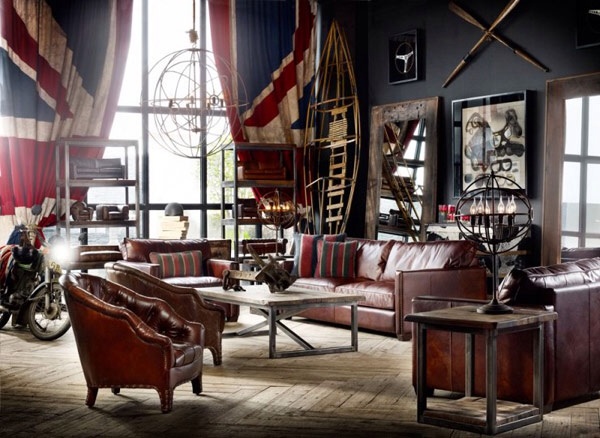
As it applies to the world of design, eclecticism is a blend of furnishing styles from a mixture of sources and time periods. An eclectic room should feature pieces with commonalities to create harmony within the design. It is a planned, deliberate design. A shared theme or component should tie everything together.

The color schemes used can be diverse, but as a general rule, neutral colors are important both as a backdrop and for large furniture pieces. Perfect colors for this style include white, cream, gray, black, brown, taupe and putty. Contrast is an important element for colors, and materials in eclectic style interior design.

Other eclectic elements include:
Collections and sets of similar pieces
‘One of a kind’ items
Global pieces from around the world
Contrast in color or finish
Traditional and modern elements together
Rough fabrics mixed with elegant textiles
Worn surfaces combined with refined surfaces
When combining various furniture pieces, assemble complementary items based on their shapes, fabrics, or finish. A curvy, French sofa can be paired with a modern chaise lounge when the materials have some commonalities – perhaps coordinating fabrics are used on each piece. An eclectic room's fabrics should harmonize with each other. Combining different finishes can also increase the feel of eclecticism in a room. For example, gray walls accentuate a silver statue, which contrasts nicely in front of an antique tapestry. The idea is to mix and match furnishings by their finishes and textures while keeping an eye on their relationship to each other in the overall room design. The main thing is a controlled contrast of diverse elements. 


image.jpg
image.jpg
image.jpg
image.jpg
image.jpg
image.jpg

Sydney favourites QT Designer Hotel and Gowings Bar & Grill

This week, while on a three day styling project in Sydney, I revisited one of my favourite city locations. A place I had dropped into frequently when I lived there many years ago... Gowings department store in George Street.

I had known it as a Sydney landmark, a menswear institution for hundreds of thousands of men and their families who had been flocking through its doors since the stores opening in 1912. It was the place to buy menswear clothing essentials, iconic Australian brands such as Bonds and RM Williams (I bought my first pair of RM boots there when I was 21) Australian soldiers were clothed there during the war years. There was even a barber shop where a 'short back and sides' cut was the order of the day. 

Sadly, in January 2006, after three years of successive losses, Gowings closed it's doors for the last time, taking with it generations of memories for Sydney shoppers. 

In recent years, however, the Gowings building has been transformed. The Design Hotel group has opened QT DesIgn Hotel Sydney - and I was fortunate to stay there on my stay this week. 

An article in The Australian newspaper by Christine Mcabb explains it all...

"The scene is set by a streamlined art deco sign above bustling Market Street where dapper porters, sporting berets and jeans, wait on the pavement.

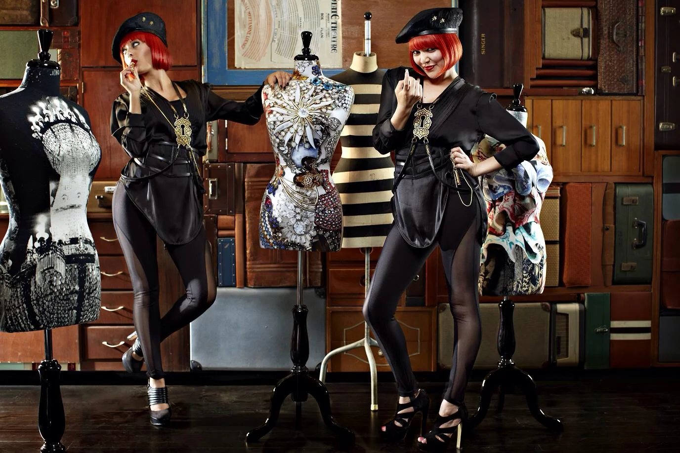
This is hotel as theatre. Staff have been cast not recruited, and all front of house personnel, from the bowtie-clad concierge to the red wigged “Directors of Chaos” visit hair and make up each morning before clocking on.

And “uniforms” are courtesy costume designer Janet Hine (the woman behind Dame Edna’s final frock).

The hotel’s 200 guestrooms occupy the building above the State Theatre and the old Gowings department store linked through the first floor lobby. Entrance is via the glittering former State Theatre shopping arcade where even the lifts get in on the act, kitted out with LED digital art (a feature throughout the hotel) and adjusting muzak according to the number of passengers on board (solo travellers might be serenaded with ‘Are you Lonesome tonight?’).

Local designers Nic Graham and Shelley Indyk have teamed up to deliver playful, stylish but eminently comfortable interiors that incorporate many of the buildings original features (a century old urinal in the men’s loo for example) and take into account the specific idiosyncrasies of each individually styled guest room.

The low ceilinged lobby is scattered with bespoke furniture and dominated by an installation of vintage luggage. The guest lounge is dotted with large velvet ottomans and the wall lined with artfully stuffed cabinets of curiosities (in fact the hotel shop selling all sorts of stylish objets d’art).

Each design-focused guestroom is different (in the Gowings building the original department store floor boards have been retained), decorated in rich reds, oranges, yellows and white, but all share certain features: an incredibly comfy ‘Gel’ bed, cleverly curated ‘artefacts’, quirky bedside lamps (in the guise of top or bowler hats, book binders or vases), an excellent mini bar (stocked with healthy snacks), Nespresso machine and a welcoming martini tray.

Where to eat
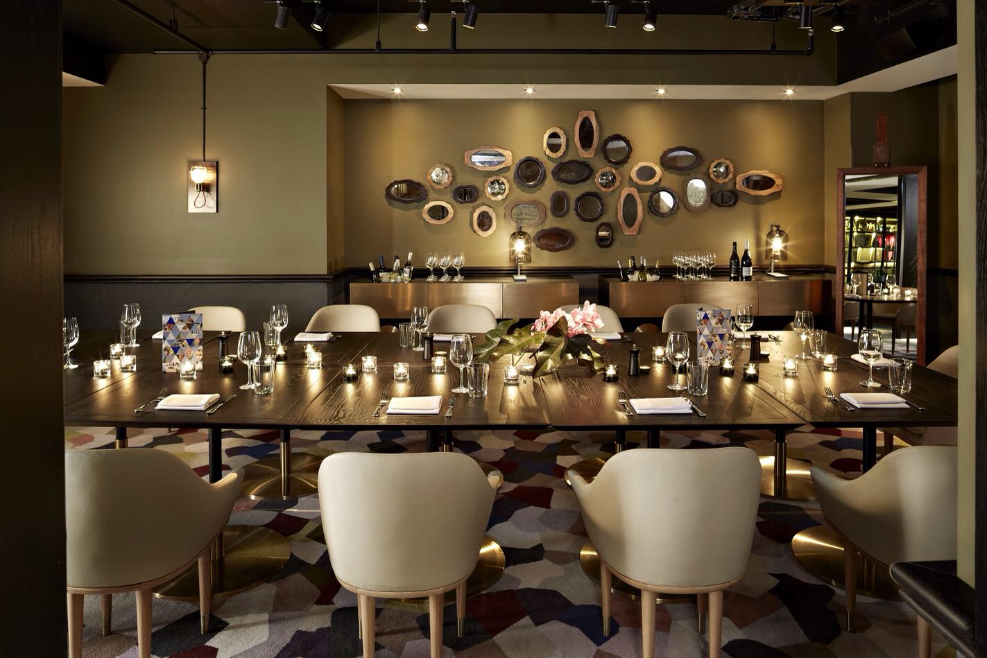
Under director Robert Marchetti and executive chef Paul Easson (ex Mebourne’s Rockpool Bar & Grill), food will be a feature at QT. On the ground floor the Parlour Lane Roasters café morphs into a wine bar after dark. Upstairs, the all-day dining Gowings Bar & Grill is the antithesis of your usual hotel eatery, a buffet free zone (in the mornings bar staff front to mix smoothies) featuring a huge open kitchen fitted with wood fired ovens and an impressive glass fronted seafood room where a giant yellow fin tuna (delivered weekly) hangs to be cut as needed. Room service is equally innovative, served in a bento style box for easy, in-bed dining."


image.jpg
image.jpg
image.jpg
image.jpg
image.jpg
image.jpg
image.jpg
image.jpg
image.jpg
image.jpg

Living minimally

While I am known for creating rich, layered textural interiors, I try to use restraint with certain design elements. Colour, for example.  A richly layered room can be sublime if a sense of order, and control is applied by using a simple monochromatic colour scheme. Similarly, a harmonious result can be achieved in an interior when, a commonality is observed between collections of objects, using style, texture or tone.

The extreme of this aesthetic, of course, is minimalist design and there is a true art to creating the perfect minimal, yet warm and visually interesting interior. It takes skill to create a flawless balance between what is not enough and what is way too much, aka, clutter. We often use the term “less is more” in design, but it isn’t necessarily about going cheap on your furnishings and accessories, it is about attaining better design through simplicity. It is about how you can get the most impact through careful editing and restraint. The less is more theory is more about how the eye visualizes a space, which is all a personal preference.

Most people forget when designing a space to add personality through texture, color, materials and patterns when attempting to add less to a space, which ultimately gives the room an unfinished appearance. It is also about harmonizing and creating a perfect balance of leaving certain spaces in a room void of furnishings and accessories. The key to creating the perfect minimal room is to create a serene and uncluttered atmosphere, not cold and sterile. Be sure to let objects have some breathing room so they are more appreciated. There is an art to creating spaces that do not have excess, but rather exude warmth and attractiveness.

Wolfgang Behnken, the creative director of Young & Rubican, has recently renovated his appartment in Hamburg, using a mix of historical pieces, a perfect off white and authentic timber tones. We love the result.

justin+bishop+minimal3.jpg
justin+bishop+minimal.jpg

Ralph Lauren "RL Vintage"

Its no secret that we love Ralph Lauren.

The RL collections have been inspiring us for years. Fashion collectors scour eBay, vintage stores, secondhand stores and more for vintage Ralph Lauren pieces. Interior designers, too, can feel the rush of a decorator high when they find pristine pieces from Lauren’s past collections out of their natural habitat of department stores and perfectly curated Ralph Lauren boutiques. But whether you get more of a thrill from the hunt or the find, a visit to Ralph Lauren’s new online concept, RL Vintage, will sate the itch for the designer’s archival duds.

RL Vintage is a response by the company to fans’ nearly insatiable need for one-of-a-kind Ralph Lauren pieces. David, Ralph’s son, discovered Japanese magazines dedicated to his father’s work in the ’80s and ’90s as well as Reflex, a boutique in Tokyo that specializes solely in finding pristine pieces of vintage Ralph and selling to collectors. Upon his return to the states, David found over 300,000 eBay listings for Ralph items and discovered a whole culture revolving around the pure American design that his father built an empire around. With the launch of RL Vintage, David brings together a collector’s dream of merchandise as well as all the details that a history buff lives for (whether its fashion history or American history is up to interpretation).

The RL Vintage site will change seasonally, and for its debut, the Web site’s first batch of 50 pieces highlight Ralph’s obsession with the American West. Native American influences, cowboy culture and the patina of bygone rodeos and cattle drives are pervade the pieces, which run the gamut from military-inspired tailoring to fringed jackets and sarape-printed blanket coats.

image.jpg
image.jpg
image.jpg
image.jpg
image.jpg
image.jpg

Dishoom East London

With its faded elegance and street food inspired cuisine, I absolutely ADORE East London’s latest eatery - Dishoom

The interior and exteriors of Dishoom are exciting, inviting, romantic and eclectic, featuring a clever mix of lighting, sepia family photographs, an array of oyster lamps and bentwood furniture… and a superbly monochromatic colour scheme! The Indian cafe style food is apparently very good but it’s the Art Deco styling that captures me the most. The restaurant is spacious, and the Bombay/Deco interiors are cleverly placed throughout a deliberately unfinished backdrop.

Antiquities, textured glass, and a dominant marble bar all make up the speak-easy charm of Dishoom. Designed by Russell Sage Studio, the designers behind Zetter Town House, The Hospital Club and St. Paul’s Cathedral, it is an imaginative and desirable space.

DISHOOM SHOREDITCH

7 Boundary Street, East London

Photography, Sim Canetty-Clarke

Photography, Sim Canetty-Clarke


Carrara

We have recently specified a porcelain Carrara tile for a clients five bathrooms.

Authentic Carrara marble is quarried in the Italian province of Carrara. It is a gorgeous stone used to make tiles, tabletops and countertops in homes around the world. 

Carrara marble, like other marbles is porous. Because of its light color it is more likely to show stains than other marbles and stones. It also needs regular care in order to maintain its beautiful surface. In addition, cleaning Carrara and other types of marble must be done properly with a pH-balanced stone cleaner. 

We love the look, but is the maintenance worth it? The obvious solution is to opt for a faux Carrara porcelain tile. The options here are endless and the quality is supurb thanks to recent advancements in technical manufacturing.

A faux marble is an intelligent choice. 

The look is stunning. Carrara is timeless and elegant. It transcends period style and can work effortlessly in a modern or traditional scheme. 


image.jpg
image.jpg
image.jpg

image.jpg
image.jpg
image.jpg
image.jpg
image.jpg
image.jpg