Embracing the Dark side

While I am known for my penchant for 'white' interiors, I have recently been gravitating toward a darker colour palette in my work.

There is something decadently luxurious about a dark interior scheme; deep natural tones in charcoal, black, chocolate, and tobacco, teamed with deep oak joinery and other timber interior details.

It's a slightly more masculine look, that suggests the feeling of an old school gentlemans office or library.  There are leather bound books, cut glass whiskey decanters and a collection of timber walking sticks.

As the following images suggest, using darker elements in a traditional scheme will not look dated or overly fussy; what we see, in fact, is a slightky contemporary edge.

By using a clever mix of beautiful fabrics, natural timbers, sophisticated colour schemes, and perfect accessories the look can be stunning, elegant, and utterly timeless.


PRODUCT REVIEW 04

Natural Marble

An important part of preparing for a renovation or new build is to select the hard finishes that work for you! The type of stone, for flooring, benchtops and/or walls, can be a difficult choice!

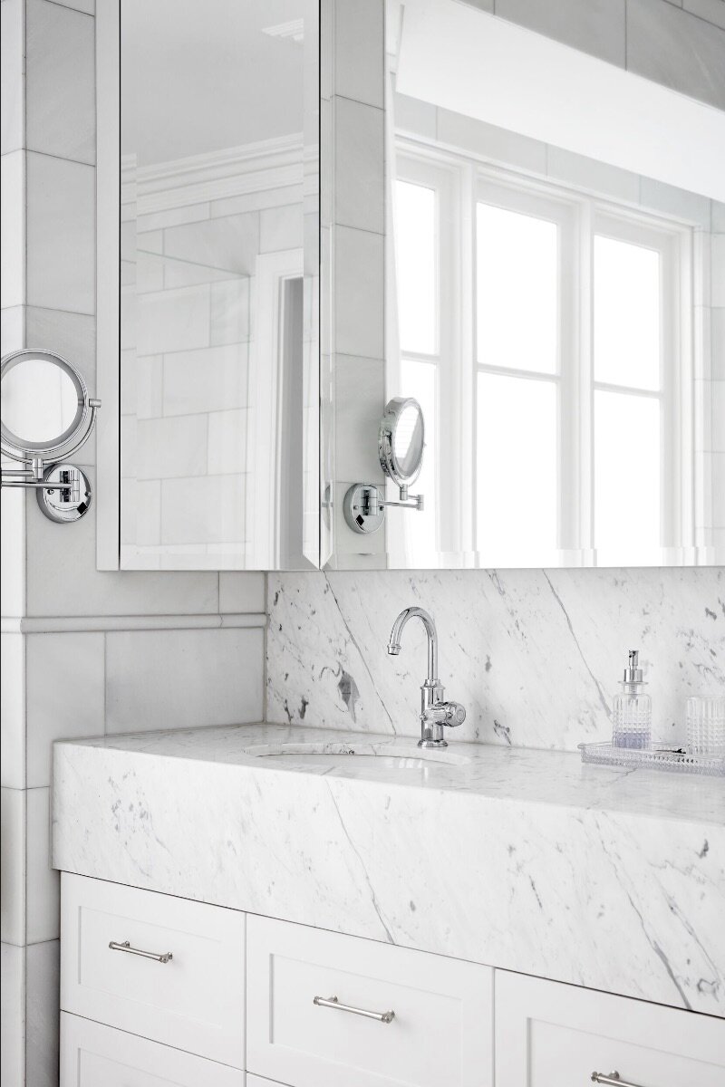
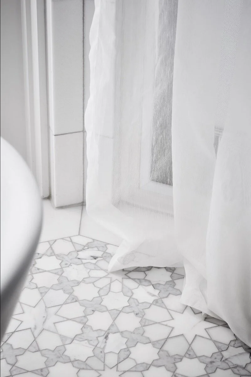
I often use a selection of natural stone, in particular, marble in my projects. At first, my clients can be apprehensive, natural marble can be a fearful choice for some. I put forward the pros and cons, and together we made an informed decision.

Carrara, Calacatta, Emperador and Crema Marfil marble - to name a few - like other natural stones, are porous. The lighter varieties (in colour), can show stains and scratches. They also need regular care in order to maintain their beautiful appearance. In addition, cleaning marble and other types of stone must be done properly with a pH-balanced stone cleaner. As a lover of natural products, I believe these drawbacks should be embraced. Imperfections show that a house has been enjoyed, lived in, they tell a story.

Some love the look, but question if the maintenance is worth it. The obvious solution, in this case, is to opt for faux stone porcelain. The options here are endless, (be it from Caesarstone, Stylestone or CDK's neolith range) and the quality is superb thanks to recent advancements in technical manufacturing. Faux stone can be a better choice for some.

The majority of the real deal is quarried in the Italian province of the name of the stone, ie Carrara and Calacatta! Imported in large quantities, Carrara is not overly expensive and is available in a variety of shades, from pure white to bardiglio black. Other marbles, including Calacatta, Statuario or Thasos (from Greece) can be more expensive, especially for the more unusual varieties.

This range of shades allows me to create stunning patterned mosaics or to add bold contrasting borders in a room. The simple white and grey tones of most marbles also mean that it can be a perfect base for colour accents, in fabric, wallpaper or joinery.

For me, nothing beats the look of authentic marble but either way, the look is stunning. Marble is timeless and elegant. It transcends period style and can work effortlessly in a modern or traditional setting.

bathroom renovation
bathroom renovation
bathroom renovation

KEEPING IT SAFE

Life as we know it is rapidly changing.

Of course, we are all well aware of the devastating affects the Coronavirus is having on our lives. It's becoming more apparent every day and it is so important that we look after one another. We need to diligently follow official advice; practice good hygiene, restrict public activities and/or implement self-isolation wherever possible.

At Justin Bishop Interior Design I am continuing to work, however, in line with this advice, I will now be keeping face to face meetings to an absolute minimum. Wherever possible I will be holding meetings online and sharing our project information more and more through our 'One Hub' client portal.

I have implemented up to date screen sharing capabilities for design presentations and product reviews. This will allow us to keep in touch remotely, to continue working on current projects and to be able to check on-site activities when required. I will be doing all that is necessary to responsibly adhere to official safety advice.

For new projects enquiries, please email or call anytime. I am here to assist and can arrange an online meeting with you at your convenience.

We must do all we can to stop the spread of this global pandemic.

For now, please keep safe, and I look forward to keeping in touch, responsibly, during this difficult time.

interior agreement - Justin Bishop Interior Design

DESIGN ADVICE 03

Accent colour

Interior design is all about balance – nothing really has a value on its own until it is thoughtfully and carefully placed with many other things. This month we see accent colours playing a key part in achieving that harmony, adding small, punchy doses of contrasting hues that can draw the eye, add visual interest and tie everything together. 

An accent colour can form part of a paint scheme; the wider fixed features, like the flooring or wall tiles; furniture; a decorative accessory. 

Colour can be a hard thing to commit to. There is always the risk of getting it wrong, and also, the fear tiring of it. So if you’re the cautious or fickle type, use accents in easily switched accessories, rather than harder to change walls and floors.

The other risk is to be too adventurous, layering too much colour, especially mixed in with patterns and prints. Colour should be used with restraint. I would suggest choosing your pallet, then editing it down to the bare essentials. Perhaps start with one colour in various strengths, then possibly add one additional complementary colour for interest. 

Any accent colour will have the effect of drawing the eye, it will usually be the first thing you look at when you enter a space. You can use this concept to help change perceptions about scale and size: placing your brightest painting at the far end of a room will make the eye look all the way through, so the room will appear as large as possible. Or just use an accent for a ‘wow’ moment: surround a colourful treasured possession with white, and no one will be able to look anywhere else.

Purple and ink blue accent colours at a recent residential installation.

Purple and ink blue accent colours at a recent residential installation.

PRODUCT REVIEW 03

Persian Rugs

A Persian carpet is a hand-knotted silk or silk/wool oriental rug from Iran (formerly known as Persia). They are known for intricate designs that are primarily oriental, floral style in a range of colours, sizes and quality. Persian Kerman rugs are a particular favourite of mine. I love the colour combinations of these rugs! They are often quite subtle, and 'de-saturated' which suits my restrained colour pallet perfectly. Today they are often woven to look antique!

Carpet weaving is an essential part of Persian culture and Iranian art. Within the group of Oriental rugs produced by the countries of the so-called "rug belt", the Persian carpet stands out by the variety and elaborateness of its manifold designs. The indigenous brilliance of local craftspeople has made Persian carpets one of the most sought after works of art in the world. 

A rug design can be described by the way the ornaments are arranged within the pile. One basic design may dominate the entire field, or the surface may be covered by a pattern of repeating figures.

In areas with traditional, time-honoured local designs, such as the Persian nomad tribes, the weaver is able to work from memory, as the specific patterns are part of the family or tribal tradition. This is usually sufficient for less elaborate, mostly rectilinear designs. For more elaborate, especially curvilinear designs, the patterns are carefully drawn to scale in the proper colours on graph paper. The resulting design plan is termed a "cartoon". The weaver weaves a knot for each square on the scale paper, which allows for an accurate rendition of even the most complex designs. Designs have changed little through centuries of weaving.

Carpet weaving still plays a major part in the economy of modern Iran. Modern production is characterized by the revival of traditional dyeing with natural dyes, the reintroduction of traditional tribal patterns, but also by the invention of modern and innovative designs, woven in the centuries-old technique. Hand-woven Persian carpets and rugs have been regarded as objects of high artistic and utilitarian value and prestige since the first time they were mentioned by ancient Greek writers.

There is always a place for Persian rugs in my interior schemes. They blend so well with my design style and add an authentic layer of character and beauty!

Persian rugs - Justin Bishop Interior Design

PRODUCT REVIEW 02

Handpainted Wallpaper

I have been lucky enough to work with hand-painted wallpapers on various projects over the years. Used in moderation, they can add a luxurious level of design to an interior scheme. 

Chinoiserie wall-coverings are probably my favourite. Designs traditionally painted in Asia, are these days often produced in Europe and North America,  where eastern designs are given a western spin. Scenes of old India, with classic architectural references, are wonderful, as are botanic scenes of China and Japan featuring plants and animals, alongside lush garden ornamentation.

While I prefer muted, monochromatic tones with just a hint of colour, I do appreciate more vibrant designs, with rich use of watercolour and gouache.

'De Gournay', 'Gracie' and 'Griffon & Wong' are traditional suppliers of hand-painted pieces. Their online galleries are well worth a look!

I am currently researching a piece for a residential project. Below are some favourites…

Handpainted Wallpaper - justin bishop

Travelling south

Travelling through Australia's rural regions - this year along our eastern shores from Byron Bay to the NSW Southern Highlands - always renews my respect for our vast country. I love being at ground level, experiencing the landscape, the colours and the beauty. There's hidden gems, waiting to be found, along the way.

I enjoy the experience of visiting family, meeting friends and discovering new places. Hopping along the coast, through some of our most iconic towns and beaches, even this year with smokey skies and blackened bushland, has inspired me, it's an experience that always stands me in good stead for the year ahead. 

Icebergs, Bondi Beach January 2020

Icebergs, Bondi Beach January 2020

Tacking Point Lighthouse, port Macquarie January 2020

Tacking Point Lighthouse, port Macquarie January 2020

Tallow Creek, Byron Bay January 2020

Tallow Creek, Byron Bay January 2020

ARCHITECTURAL ILLUSTRATION

From stained-glass windows to intricate stone carvings, Gothic architecture is incredibly impressive—especially considering many features were crafted by hand. It’s no surprise then that these ornate structures are the inspiration behind Bournemouth, England-based artist Phoebe Atkey highly-detailed architecture drawings.

From the arched doorway of Strasbourg Cathedral to Notre-Dame’s famous rose windows, Atkey captures the beauty of some of Europe’s most iconic buildings. The young, self-taught artist hand draws every ornate detail with incredible precision and perfect proportion. Atkey renders each drawing using a combination of pen and pencil, but keeps her palette monochrome. Clever shading and highlights make certain parts of the drawing appear three-dimensional, almost like you could reach out and touch the buildings’ stoney surfaces.

architecture drawings - justin bishop

Art of dining 2019

Art of Dining 2019, held this week at the National Gallery of Victoria, was an event filled with creativity, beauty, elegance and intrigue.

Forty four designers, artists, stylists and retailers came together in support of the NGV, each presenting their ultimate dinner table, in their own individual style.

Almost 4000 design aficionados came through the doors to view this remarkable and truly inspirational event, held over two nights and  two days at the NGV.

I was honoured to be asked to take part as a designer. From the outset, I knew I wanted to produce a table befitting my timeless design style;  based on my love of classic design.  

My artist statement...

“The architectural model seen at the heart of my Art of Dining table is a reference to my passion for neoclassical design and my early design days working as a decorative model maker. The model, styled in my signature colours of black and antique gold, features neoclassical motifs, it is the hero of my table scheme and one could say, of my design aesthetic.

The period of Neoclassicism began in the mid-18th century. In its purest form, it is a style principally derived from the architecture of classical antiquity, the Vitruvian principles, and the work of the Italian architect Andrea Palladio, one of my design hero’s.

Today, In my interior design work, the timeless elegance of neoclassicism is paramount and remains one of my greatest influences.”

Thrilled with the outcome, this was a truly amazing event!

Art of Dining 2019 - Best of the Best

National Gallery of Victoria 

May 1st-3rd 2019

Art of Dining - justin bishop

Art of Dining... Developing a concept

The concept I am developing for my Art of Dining table is a reference to my love of neoclassical design and an homage to my early design days working as an architectural  model maker. My table, styled in my signature colours of black and antique gold, will feature neoclassical motifs.

The period of Neoclassicism began in the mid-18th century. In its purest form, it is a style principally derived from the architecture of classical antiquity, the Vitruvian principles, and the work of the Italian architect Andrea Palladio, one of my design hero’s.

The timeless elegance of neoclassical style is paramount in my work and remains one of my greatest influences. 

I’m excited to be bringing my table concept to life in May! Tables will be on view in the NGV Great Hall – Thu 2 May and Fri 3 May, 10am-5pm & Thu 2 May 6-9pm Tickets on sale now!

https://www.ngv.vic.gov.au/support-us/ngv-womens-association/events/art-of-dining-best-of-the-best/

Art of Dining concept - justin bishop

Art of Dining: Best of The Best 2019

“Art of Dining: Best of the Best 2019 brings together 44 spectacular tables designed by Australia’s leading artists, interior designers, couturiers, florists, stylists and retailers.

Visitors will view tables from the whimsical to the avant-garde celebrating creativity and innovation in dining design. A stellar line up of Creatives are generously donating their rare and wonderful talent.”

I have been invited to take part as a designer in this prestigious event, and I am truly honoured. Planning and executing this will be an exciting, creative challenge and an absolute highlight in my year!

It will be a must see for all design aficionados,

 https://www.ngv.vic.gov.au/support-us/ngv-womens-association/events/art-of-dining-best-of-the-best/

Tables will be on view in the NGV Great Hall – Thu 2 May and Fri 3 May, 10am-5pm & Thu 2 May 6-9pm

Tickets on sale early March 2019.


IMG_6860.JPG
IMG_6357.JPG
FullSizeRender.jpg